Posts

Showing posts with the label Technology

Navigation Placeholder

My Experience With The New Blogger Backend...

Image
Last year, Blogger began rolling out a new interface for maintaining blogs on the Blogger platform. The new interface has a clean and supposedly phone-friendly design featuring more white space and larger buttons for fat-fingered usage. However, under the hood, there were some rather surprising changes. The Blogger team made a formal announcement of the change on the Blogger Buzz blog: We'll be moving everyone to the new interface over the coming months. Starting in late June, many Blogger creators will see the new interface become their default, though they can revert to the old interface by clicking Revert to legacy Blogger in the left-hand navigation. By late July, creators will no longer be able to revert to the legacy Blogger interface. The rendering of HTML took a decidedly unwelcome turn when Blogger users discovered that certain HTML tags would be stripped out automatically. For users that rely on third-party apps to make formatted posts like those who post recipe c...

An Essential Template Review...

Image
Recently, I stumbled upon a new template hidden deep in the recesses of the Blogger template gallery called Essential . Sneaking a new template into the gallery without an announcement is NOT cool Blogger Team! At first glance, Essential looks strikingly similar to Contempo , but, under the hood, they are slightly different. Informal testing using Google's Page Speed Insights utility showed about a 2% improvement in speed for Essential vs. Contempo . Some gadgets like the Report Abuse gadget have been moved out of the sidebar with Essential . It appears that Essential is geared toward an even more minimalist style than Contempo with less emphasis on sidebar content. Also, if you happen to empty your sidebar in Essential , the sidebar and its hamburger will automatically disappear and the content will center itself on the page. This is a definite improvement over Contempo . Although the transition from Essential to Contempo was largely painless even with heaping helping...

Contempo In A Multi-Column Layout Using CSS Grids...

Image
A while back, I created a gadget to convert Contempo into a Two-Column Layout . At one point, I had managed to do most of the heavy lifting using complicated CSS, but, ultimately, the CSS proved to be a bit flaky and would sometimes fail in some horribly noticeable way. One of the underlying issues was that every once in a while, an errant bold tag would show up among the post snippets and break the normal flow of the page. This errant bold tag was not noticeable in plain vanilla Contempo , but, would rear its ugly head when custom CSS was applied to post snippets that attempted to implement multiple-column layouts in Contempo using floats or other positioning techniques. I've seen errant bold tags pop up at random on all of my blogs, but, I was never able to determine definitively, if the issue was triggered by my own content or if it was perhaps a bug in the Blogger back end. Recently, I decided to revisit the subject of multi-column layouts in Contempo , so, the first o...

Soho And The Missing Hamburger...

Image
A while ago, I devised a solution for a Missing Hamburger In The Contempo Template . Recently, someone stopped by looking for a Soho -flavored solution. For those of you who are unaware, here's a bit of background on the problem... When Blogger rolled out new templates in 2017, the navigation scheme for the new templates was a bit different. I discovered that if your screen width was below a certain width, the sidebar menu was not visible on the home page. For affected users, a "hamburger" icon on the page allowed access to the sidebar menu. However, if you navigated to a post, the hamburger icon disappeared entirely, so, those of us with screen widths below a given width, could not access the sidebar menu at all from post pages. After some poking around I came up with the following Soho -flavored solution. Simply copy and paste the following code into a new HTML/JavaScript gadget: <script type="text/javascript"> var d=document; var divs; divs=d.ge...

Expanding and Collapsing Sections in the Contempo Sidebar...

Image
I wasn't really thrilled with the default About Me section offered by Blogger that links to my profile, so, for a while, I simply didn't have an About Me section. Recently, I wanted to reorganize my sidebar and group some links into a custom  About Me section. Since the new section would, and really should, be at the top of the sidebar, I didn't want it to negatively impact the other sidebar sections below. So, I came up with a way to reuse the expanding and collapsing functionality that appears in the archive and labels sections. In this way, it was hoped that the new section could be collapsed and take up less space in the sidebar. To reuse the expanding and collapsing feature of the archive, the first thing that I did was to inspect the code for the archive. After some investigation, I determined, that in the archive, the key component is the <details> tag. Within the details tag are the up and down arrows and the archive list itself. As a result of my...

A Color-Shifting Header For Contempo...

Image
Sometime ago, I wanted a little something extra in the header to make the image pop a bit, so, I came up with a simple color-shifting mechanism for Contempo that could be applied to any header image. I had mentioned this technique a few times before, but, recently, I felt a little more detail was in order. Just add the following CSS code using Theme > Advanced > Customize > Add CSS : @keyframes colorshift { 0% {background-color: orange ;} 10% {background-color: yellow;} 30% {background-color: red;} 50% {background-color: white;} 60% {background-color: blue;} 80% {background-color: black;} 90% {background-color: green;} 100% {background-color: orange ;} } .bg-photo-overlay { background-color: orange ; opacity:0.25; filter:alpha(opacity=25); background-repeat:no-repeat; background-image:none; animation-name: colorshift; animation-duration: 30s ; animation-iteration-count: infinite; } In the CSS code above the running time for the animation is set in seconds w...

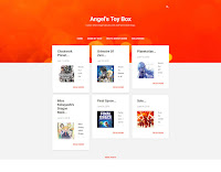
Creating A Dynamic Flipcard Gallery For Blogger...

Image
Years ago, Blogger Introduced Dynamic Views , but, at the time, I wasn't entirely convinced to take the plunge as an early adopter. Recently, I decided to revisit the subject and create a modest Dynamic Flipcard Gallery by invoking a dynamic view in a frame. To get started, add the following HTML using the HTML view in the editor to the post or page where the Dynamic Flipcard Gallery  should appear. Substitute the highlighted text with your blog URL (i.e.: https://www.example.com or https://example.blogspot.com ): <iframe frameborder="0" height="780" src=" [YOUR BLOG URL GOES HERE] /view/flipcard" width="100%"></iframe> Dynamic views come with a variety of features out-of-the-box like a header and filter controls, but, as these features are not really needed for this application, use the following CSS code to hide elements that are not needed for the gallery: .flipcard #header, .flipcard #controls, .flipcard #header-cont...

A Side-Scrolling Header For Contempo...

Image
Dimensions: 3000x500 I wanted an animated background in my header, but, I didn't necessarily want a movie playing in the header. While, I think it might be possible, with some sophisticated engineering, to place a YouTube video in the header, I didn't really want something as over-the-top as a YouTube video. Instead, I decided to focus my efforts on using CSS animation techniques to make a background that scrolls sideways. The first step is to pick a header image that is fairly wide and can repeat without showing a hard line. Using Theme > Customize > Background , I uploaded an image, set the alignment to tile and checked the box for scroll with page . When uploading background images, Blogger recommends an image be no wider than 1800 pixels and limits the file size to less than 300Kb. The height of the image should be at least, if not larger than, the height specified using: Theme > Customize > Advanced > Backgrounds > Background Height ...

Twenty Years And Counting...

Image
This is quite a bit off-topic and about seven months after the actual 20th anniversary of the Anime Rating Guide circa October 2018. Lately, I've been fielding questions regarding some of the behind-the-scenes work that I do to manage this blog and I thought this would be good opportunity to answer some of those questions and commemorate twenty years in existence. Also, before I begin, it should be noted that for some reason that defies description, Advancer Tina , is getting quite a bit of attention lately. But, it's O.K. After all, that's why Tina volunteered for that suicide mission... Is blogging a lot of work? No . Not really. Or, at least it doesn't have to be. Blogging isn't hard. Blogging is about sharing your passion with the world. My passions are anime and computer programming. I've been sharing with the world since 1998. A long time ago, when GeoCities was relatively new and before Yahoo killed it to death, I had already been a devout anime ...

The Anime List Gets An Upgrade...

Image
The Anime List has been an integral part of the Anime Rating Guide since its inception over twenty years ago. My latest adventure being a geek involved upgrading the Anime List . Previously, I used MS Access  to generate lists for two static pages -- a list of anime sorted by title and a second list of anime sorted by rating. I really wanted to combine these two pages into one page that would allow filtering and sorting on demand. So, taking inspiration from Stuart Langridge's Sortable , I used MS Access to generate one list of anime sorted by title, and let the Sortable gadget work its magic. Then, I wrote some custom code to handle filtering on-the-fly and viola, the new Anime List was born. Everything went reasonably well, but, there were a couple of issues using the Sortable gadget. First, since the list is already sorted, I wanted Sortable to indicate the current (sorted) status of the list to the user. That involved poking around in the code to get Sortable to d...

The Sidebar And The Nuclear Option...

Image
Recently, a visitor stopped by with a question regarding the sidebar and the margins. In general, adjustments can be made to the content area, the sidebar area and the margins through the Widths menu by selecting Theme > Customize > Advanced > Widths . I've found it useful to let the Contempo template do most of the heavy lifting, but, since the template isn't ideally suited for really wide screens, there can be a lot of white space on really wide screens. So, for screens that exceed a certain width, I use a percentage for the maximum width rather than a fixed number. This allows the content area to use more of what would otherwise be empty space. The CSS snippet below overrides the fixed number defined in the Widths menu, but, only on screens wider than 1300 pixels: @media only screen and (min-width: 1300 px) { .page_body .centered { max-width: 70% ; } } In the CSS code above, any value from 70% to 100% should work reasonably well. To add a CSS snippet us...