Posts

Showing posts with the label How To

Navigation Placeholder

Archive

Show more

View Archive In A Table Format In Contempo...

Image
The table view can either be in your sidebar or in the page body. Archive in Sidebar and Script below. Archive in Page Body and Script below (off screen). After invoking the nuclear option and getting rid of my sidebar, I was thinking about archives and how eminently un-useful they are and I thought to myself. You know what might be really cool... a table. After quite a bit of poking and prodding, I managed to get a proof-of-concept up and running. A table in a sidebar sounds really interesting until you try to stuff one into less than 300 pixels. Then the reality of the situation reveals itself. This sort of insanity isn't meant for small spaces, so, I've placed my archive table right in the middle of my page.

My First Handmade SVG Image: A Person Icon With A Transparent Background...

Image
If Your Browser Supports SVG, An SVG Image Will Appear Here This is very off-topic, but, I wanted to share. For the link to my about page, I wanted a person icon with a transparent background. I had tried a conventional image format like PNG, but, after staring at it on my phone for a while and comparing it to the search icon across from it, I really wanted an icon that remained crisp at different resolutions. SVG seemed to be the format of choice for such things. I needed a generic person icon of my very own in SVG format and with so much AI-generated slop begging for link backs, I decided to try my hand at making my own. After a bit of tinkering on CodePen , I came up with my person icon.

Centered Headers In Contempo...

Image
Years ago, when I installed the Contempo template for the first time, I managed with some brute force tactics and a lot of duct tape, to get the header centered. At the time, It took quite a bit to make it happen and there was a lot of pain involved. The reason for all the pain is that Contempo has multiple headers and the template switches between them depending on if you're scrolling, or are on the main site, or on a post or static page. Years ago, I didn't really document what was involved, I just threw everything at it to see what would stick. Now, years later, I don't feel like messing with my old code.

Page Numbering In Contempo...

Image
In the aftermath of Blogger removing support for some third-party widgets in their widget store (? I guess), some third-party services simply stopped working. Among the casualties were a number of related posts and page numbering widgets. Some time ago, I acquired code for a decent page numbering mechanism from another site: Helplogger and adapted it for my own use with the Contempo template. The difficulty with some of these widgets is they would rely on external code repositories to do the heavy lifting. And when those repositories stopped working or were otherwise compromised, many users would be affected.

An Essential Template Review...

Image
Recently, I stumbled upon a new template hidden deep in the recesses of the Blogger template gallery called Essential . Sneaking a new template into the gallery without an announcement is NOT cool Blogger Team! At first glance, Essential looks strikingly similar to Contempo , but, under the hood, they are slightly different. Informal testing using Google's Page Speed Insights utility showed about a 2% improvement in speed for Essential vs. Contempo . Some gadgets like the Report Abuse gadget have been moved out of the sidebar with Essential .

Contempo In A Multi-Column Layout Using CSS Grids...

Image
A while back, I created a gadget to convert Contempo into a Two-Column Layout . At one point, I had managed to do most of the heavy lifting using complicated CSS, but, ultimately, the CSS proved to be a bit flaky and would sometimes fail in some horribly noticeable way. One of the underlying issues was that every once in a while, an errant bold tag would show up among the post snippets and break the normal flow of the page. This errant bold tag was not noticeable in plain vanilla Contempo , but, would rear its ugly head when custom CSS was applied to post snippets that attempted to implement multiple-column layouts in Contempo using floats or other positioning techniques.

Soho And The Missing Hamburger...

Image
A while ago, I devised a solution for a Missing Hamburger In The Contempo Template . Recently, someone stopped by looking for a Soho -flavored solution. For those of you who are unaware, here's a bit of background on the problem... When Blogger rolled out new templates in 2017, the navigation scheme for the new templates was a bit different. I discovered that if your screen width was below a certain width, the sidebar menu was not visible on the home page. For affected users, a "hamburger" icon on the page allowed access to the sidebar menu. However, if you navigated to a post, the hamburger icon disappeared entirely, so, those of us with screen widths below a given width, could not access the sidebar menu at all from post pages.

Expanding and Collapsing Sections in the Contempo Sidebar...

Image
I wasn't really thrilled with the default About Me section offered by Blogger that links to my profile, so, for a while, I simply didn't have an About Me section. Recently, I wanted to reorganize my sidebar and group some links into a custom  About Me section. Since the new section would, and really should, be at the top of the sidebar, I didn't want it to negatively impact the other sidebar sections below. So, I came up with a way to reuse the expanding and collapsing functionality that appears in the archive and labels sections. In this way, it was hoped that the new section could be collapsed and take up less space in the sidebar.

A Color-Shifting Header For Contempo...

Image
Sometime ago, I wanted a little something extra in the header to make the image pop a bit, so, I came up with a simple color-shifting mechanism for Contempo that could be applied to any header image. I had mentioned this technique a few times before, but, recently, I felt a little more detail was in order. Just add the following CSS code using Theme > Advanced > Customize > Add CSS :

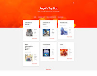
Creating A Dynamic Flipcard Gallery For Blogger...

Image
Years ago, Blogger Introduced Dynamic Views , but, at the time, I wasn't entirely convinced to take the plunge as an early adopter. Recently, I decided to revisit the subject and create a modest Dynamic Flipcard Gallery by invoking a dynamic view in a frame. To get started, add the following HTML using the HTML view in the editor to the post or page where the Dynamic Flipcard Gallery  should appear. Substitute the highlighted text with your blog URL (i.e.: https://www.example.com or https://example.blogspot.com ):

A Side-Scrolling Header For Contempo...

Image
Dimensions: 3000x500 I wanted an animated background in my header, but, I didn't necessarily want a movie playing in the header. While, I think it might be possible, with some sophisticated engineering, to place a YouTube video in the header, I didn't really want something as over-the-top as a YouTube video. Instead, I decided to focus my efforts on using CSS animation techniques to make a background that scrolls sideways.

The Anime List Gets An Upgrade...

Image
The Anime List has been an integral part of the Anime Rating Guide since its inception over twenty years ago. My latest adventure being a geek involved upgrading the Anime List . Previously, I used MS Access  to generate lists for two static pages -- a list of anime sorted by title and a second list of anime sorted by rating. I really wanted to combine these two pages into one page that would allow filtering and sorting on demand. So, taking inspiration from Stuart Langridge's Sortable , I used MS Access to generate one list of anime sorted by title, and let the Sortable gadget work its magic. Then, I wrote some custom code to handle filtering on-the-fly and viola, the new Anime List was born.

The Sidebar And The Nuclear Option...

Image
Recently, a visitor stopped by with a question regarding the sidebar and the margins. In general, adjustments can be made to the content area, the sidebar area and the margins through the Widths menu by selecting Theme > Customize > Advanced > Widths . I've found it useful to let the Contempo template do most of the heavy lifting, but, since the template isn't ideally suited for really wide screens, there can be a lot of white space on really wide screens. So, for screens that exceed a certain width, I use a percentage for the maximum width rather than a fixed number. This allows the content area to use more of what would otherwise be empty space. The CSS snippet below overrides the fixed number defined in the Widths menu, but, only on screens wider than 1300 pixels:

A Hamburger By Any Other Name...

Image
Recently, someone stopped by to ask if it was possible to add the text "Menu" below the hamburger icon in the Contempo template. The short answer is YES . There are two ways to make the change. The text can be added using CSS as shown below or the text can be added manually to the theme HTML, but, editing the theme HTML is not really my area of expertise, so, I'll leave that to the fine folks at the Blogger Help Forum  or if Blogger is feeling a bit less than useful today, the fine folks at StackOverflow will be happy to help.

Show Pages On Posts In Contempo...

Image
The Contempo template comes with a variety of nice features out of the box and has been fairly good to me in the time that I have been using the template, but, there have been some slight annoyances with the template. One of the notable annoyances I've uncovered is that the pages gadget appears on the main page, but, not on posts. Recently a visitor noticed that I had overcome this issue and wanted some insight on how I'd managed to do this, so, I thought it would be appropriate to share.

An Unnecessarily Complicated Slideshow For Blogger...

Image
After watching Rail Wars , which depicts a whole host of trains and locales, I felt a need to provide some thumbnails from the series. That would mean loading 48 images every time the page is loaded, even if no one was interested in seeing all of the images. After looking into a Variety of CSS-based Slideshow Gadgets , a common theme that emerged with existing slideshow gadgets, was the need to load all of the images at one time. To keep the slideshow's footprint relatively small, I really wanted to avoid loading all of the slideshow images at one time, if at all possible.

Contempo And The Missing Hamburger...

Image
When Blogger rolled out new templates in 2017, the navigation scheme for the new templates was a bit different. Those of us who happened to have the screen width set below a given width, discovered that the sidebar menu was not visible on the home page unless you selected a "hamburger" icon on the top-left corner of the page. And, if you navigated to a post, the hamburger icon disappeared entirely, so, those of us with screen widths below a given width could not access the sidebar menu at all from post pages.

Surviving the Move from Post To Snippet...

Image
Last year, Blogger launched new templates. I selected the  Cntempo Template  and a feature of this template is to offer snippets of a number of posts on the home page with links to the full posts that underlie each each snippet. In many of my posts, I offer ratings for anime, movies or TV shows and I wanted a way to display the ratings in the snippets, so, visitors would not have to open a particular post to see a rating.

Linking Snippet Text to Posts In Contempo...

Image
Last year, Blogger released new templates. In the Contempo template, visitors wishing to access the  underlying post can select the snippet title or a "read more" link under the snippet text, but, the snippet image and text are not linked to the underlying post. I wanted a means of making the snippet image and text link to the underlying post, so, after some trial and error, I made the following gadget:

Contempo In A Two-Column Format...

Image
Blogger  launched new templates a few months ago and, although the  new templates have some nice features, there is still room for improvement. The Contempo template presents posts as a series of snippets and originally, the snippets were presented one per row. I wanted a way to display more snippets in less space, so, I explored different mechanisms for achieving the desired result. At one point, I had managed to do most of the heavy lifting using a complicated style sheet, but, ultimately, the CSS proved to be a bit flaky and occasionally, a post snippet would either disappear or would be misaligned in some horribly noticeable way. Eventually, I created the following gadget: