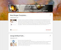
New Blogger Templates...
 Yesterday, I received a notification that Blogger has new templates. The new templates have the more responsive feel of the dynamic templates without some of the limitations of the dynamic templates. I tried a variety of different templates and settled on one of the Contempo themes. Out of the box, the new themes have some nice features like a popup sidebar menu, a floating title bar, a featured post gadget and a popular post gadget. They have a clean minimalist feel that apparently works on the small screen as well as on the big screen. It remains to be seen, but, that, at least, is the claim.
There were some issues settling into the new template, but, I can live with the new design. My legacy site had a custom title image. The new template offers the ability to change the bsckground of the top half of the page and also to add a custom image to the title area. However, I wanted to apply my header image to the floating header bar. So, I had to add some custom CSS to the advanced section of the customize theme menu. In addition, I wanted to enhance the image and text with rounded corners and text shadows. Below is a snippet of CSS that I used to achieve the effects:
.blog-name {The blog-name container houses the title text, the blog description text and the tab menu, so, the image needs to be appropriately sized to accommodate all of the header content. I found through trial and error that for my purposes, 900x200 seems to work reasonably well. The text color on the floating header bar is dark because the assumption is that the header bar background should be white, but, with my image as a background, I needed the text color to be white. The sticky widget entries (see above) are where I change the text color to white. I also added a bit of padding to move the text away from the edge of the floating header.
background: #000000 url(your-image-link-goes-here) no-repeat scroll 0 0;
-o-border-radius: 20px;
-moz-border-radius: 20px;
-webkit-border-radius: 20px;
-khtml-border-radius: 20px;
border-radius: 20px;
border: 1px solid #d3d3d3;
}
.blog-name h1, .blog-name p, .tabs a {
text-shadow: 0 1px #000;
}
.blog-name h1, .blog-name p {
padding-left: 10px;
}
.centered-top-container.sticky .widget.Header h1 {
color: #ffffff;
padding-left: 10px;
}
.centered-top-container.sticky .widget.Header h1 a, .centered-top-container.sticky .widget.Header h1 a:visited, .centered-top-container.sticky .widget.Header h1 a:hover {
color: #ffffff;
}
.post-outer-container, .PopularPosts {
-o-border-radius: 20px;
-moz-border-radius: 20px;
-webkit-border-radius: 20px;
-khtml-border-radius: 20px;
border-radius: 20px;
border: 2px solid #cccccc;
}
The featured post gadget will take a post image and artificially enlarge the image to fill a space above the featured post. It would look pretty good if the source image was high resolution, but, when the images are low resolution, as is the case with many of my images, the results can be less than appealing. I tried to work around this issue, but, in the end, I decided to just turn off the feature as it was more trouble than it was worth for my humble needs. On the bright side, the popular posts gadget makes use of the usage data to provide a handful of links to popular content on the site. That was actually quite useful, so, I turned that feature on.
The navigation scheme is a bit different with the new templates. There appears to be an issue where the hamburger icon is not visible, making the sidebar menu inaccessible below a certain page width. Since my display is set to a width of 1280, I found that I had to set the Zoom level to 80% to force the sidebar to appear on post pages, otherwise it was inaccessible. I don't like editing the HTML as it can become a maintenance issue down the road if the default template is changed.
After poking around on the Blogger Help Forums, it seems that the Blogger team is still addressing some of the issues reported by users, so, for the time being, I'd like to avoid making changes to the HTML and use a clean template. I'll wait to see how the template evolves before making any changes to the HTML.
I added some custom CSS to the advanced section of the customize theme menu to position the sidebar menu icon. While I was at it, I also fixed an issue where the sidebar would appear in the wrong position when activated after scrolling the page. In addition, I fixed an issue where the thumbnail images were not being cropped correctly in Internet Explorer and where the search box background was transparent, making it difficult to read the search text against an image background. Below is a snippet of CSS that I used to achieve the effects:
.return_link {Overall, the new Contempo template is very good. It took a bit longer than I would have liked to settle in, but, more than a few things work out of the box, so, kudos to the Blogger team on a job well done.
position:relative;
left: -50px;
}
.sidebar-container {
position: fixed !important;
margin-top: 50px;
border-top: 20px solid #f38a23;
height: 75%;
overflow-y: scroll;
overflow-x: hidden;
}
.snippet-thumbnail, .item-thumbnail {
overflow: hidden !important;
-o-border-radius: 10px;
-moz-border-radius: 10px;
-webkit-border-radius: 10px;
-khtml-border-radius: 10px;
border-radius: 10px;
border: 1px solid #cccccc;
}
.BlogSearch {
background-color: rgba(255,255,255,0.25) !important;
}


